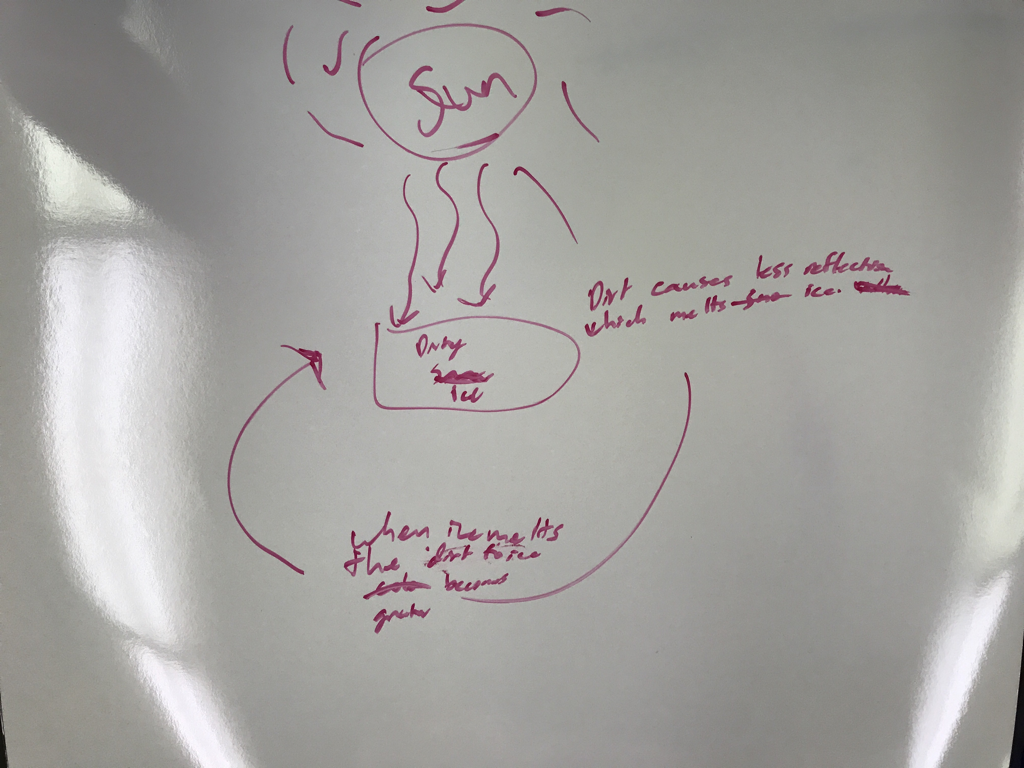
 Possible Dirty ice Feed back loop 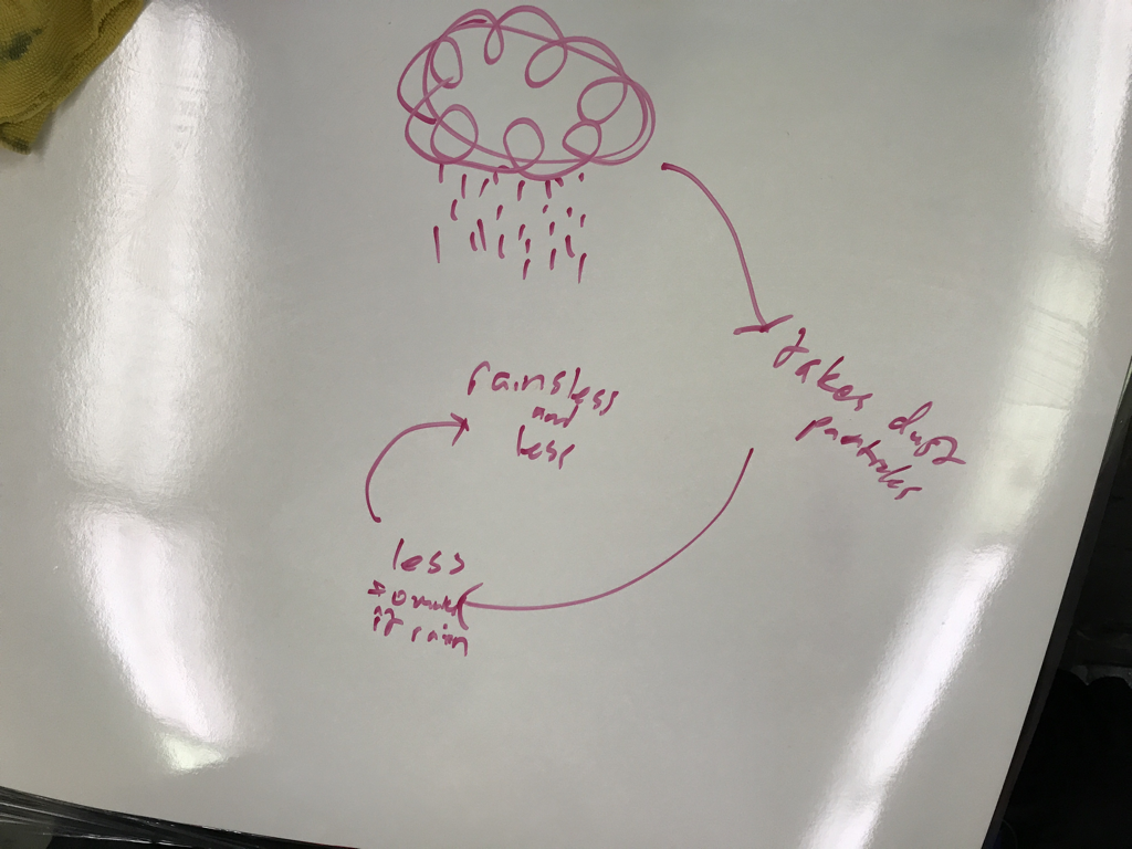 Possible Rainy Day Feed Back Loop  Very strapped for ideas possible feedback loop for volcanic eruptions
0 Comments
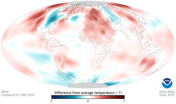
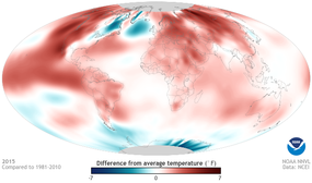 This is the difference from average temperature in 2015. It is only one year apart from the 2014 trend that was followed for at least 14 years and it changed this much in one year. This shows that the world is definitely heating up and it is becoming increasingly rapid. 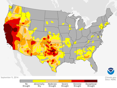 This is a map of drought severity in the United States. It is interesting because it shows which areas are being affected by changing wind currents the most. This was taken in 2010 and it corresponds with the below graph. 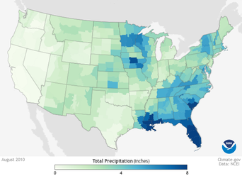 This is a graph f precipitation in the United States in 2010. It displays the amount of precipitation in the US, and it is interesting because one can see that California received almost zero inches of rain in this year. 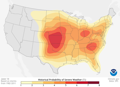 This is a probability calculation of severe weather on June 14. This is interesting because right around this time it hits its peak from an upward trend and then goes on a downward trend. It shows that near the middle of the year the US is more likely to have weather that causes damage. If it is compared to a temperature map, one can see that the higher the temperature is, the more likely that severe weather occurs. 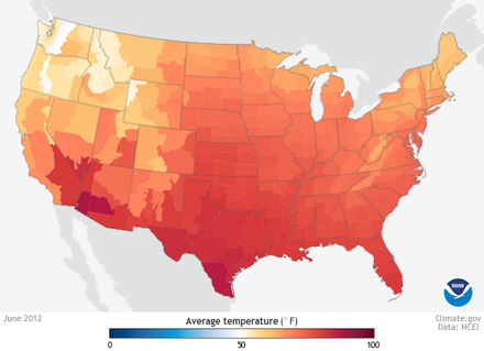 This is the corresponding temperature chart for the same month. It turns out that temperature actually peaks in July, but the trend-line for both temperature and severe weather is the same.
|
AuthorWrite something about yourself. No need to be fancy, just an overview. Archives
October 2017
Categories |
Zoe's Dish
 RSS Feed
